GE ELECTRONICS CONCEPTS
PROJECT
Packaging Concepts
ROLE
Design Director/Designer
STUDIO
Dragon Rouge
CLIENT
General Electric
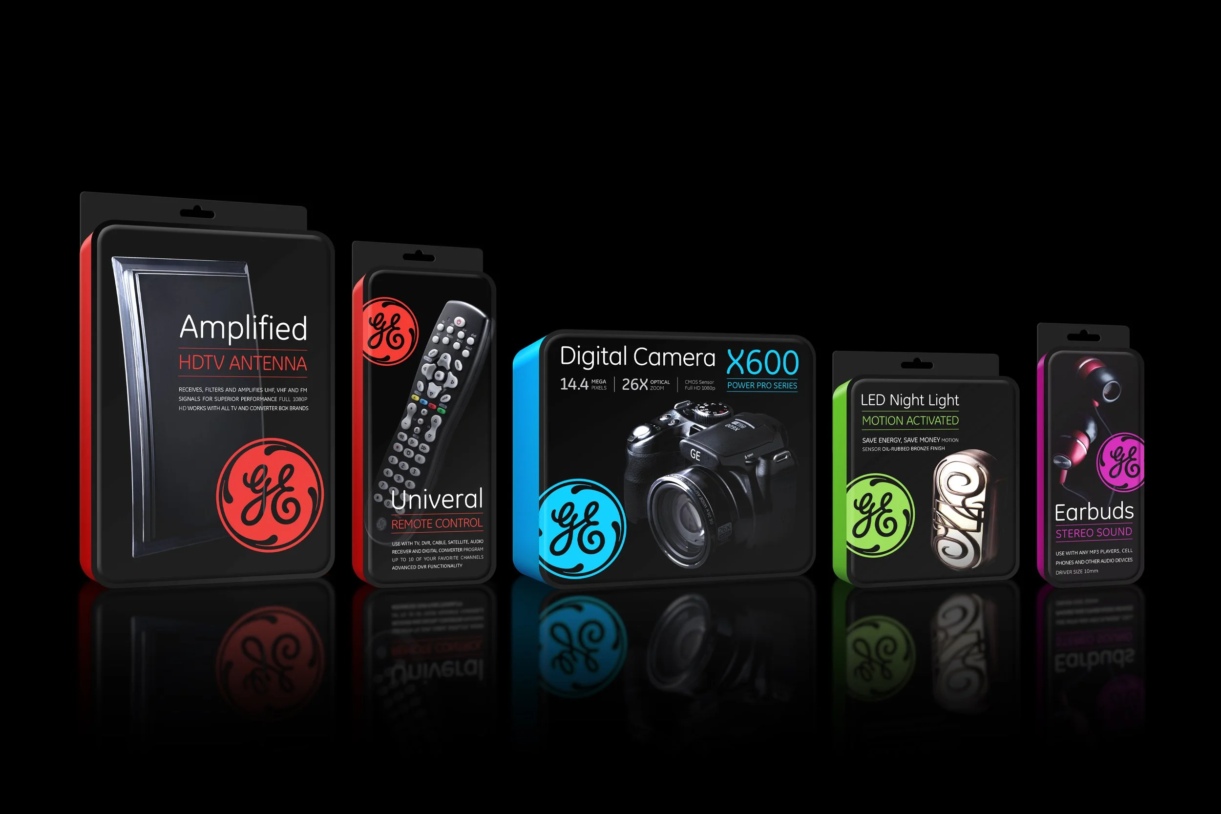
GE asked Dragon Rouge to redesign their electronics packaging to elevate their quality perception and stand out more on shelf while creating greater consistency throughout the line.
We looked at developing a distinct photography style to help visually link the wide range of products. Simplifying the information on the front of pack was also crucial to improve navigation and create a more impactful shelf presence.
Structural exploration played with rounded forms that were easy to open yet tamper evident. The roundness of the packaging references the shape of the GE logo and helps to differentiate from other electronics packaging.
CONCEPT 1

CONCEPT 2